A modal window is a powerful way of alerting users about important information on a website. For example, modal windows are often used for delivering warnings or drawing the user’s attention to crucial information that they may otherwise have overlooked.
Example of a modal window:

Let’s look at the code behind the modal window. This first section (Code 1) below is the button trigger modal. This button works as a link and when clicked, targets the modal content listed in the next code section (Code 2). The two primary areas that should be updated are highlighted below.
Code 1:
<button class="btn btn-primary" type="button" data-toggle="modal" data-target="#AboutQuestions">
Button Title
</button>
The data-target value AboutQuestions targets a specific modal to toggle, and the target defined here also needs to be defined in Code 2 below (see green highlighted sections). The target value must be exactly the same in the button trigger modal and modal code.
The Button Title is the title of the button displayed on the website. When the button is clicked, it will target the modal content in the code below.
If you would prefer the trigger modal be a link rather then a button, use this code:
<a href=”#AboutQuestions” data-toggle="modal">Link Title</button>
Below is Code 2, this is the full modal code.
Code 2:
<div class="modal fade" id="AboutQuestions" tabindex="-1" role="dialog" aria-labelledby="AboutQuestions" aria-hidden="true">
   <div class="modal-dialog" role="document">
      <div class="modal-content">
         <div class="modal-header">
            <button type="button" class="close" data-dismiss="modal" aria-label="Close">
               <span aria-hidden="true">×</span>
               <h4 class="modal-title" id="AboutQuestions">Header Text</h4>
            </button>
         </div>
         <div class="modal-body">
            <p>Body Text</p>
         </div>
         <div class="modal-footer">
            <button type="button" class="btn btn-primary" data-dismiss="modal">Close</button>
         </div>
      </div>
   </div>
</div>
The Header Text (highlighted above) displays at the very top of the modal, to the left of the dismiss action “x”. The modal header text is used to personalize the default header of a modal.
The Body Text (highlighted above) is the content that displays in the body of the modal window.
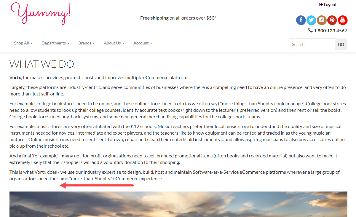
Now that we know what areas need to be updated to personalize the modal window, let’s move into implementing this code on the website. In this example, we will be placing the modal window on the About Us page and the trigger will be in the form of a button. The placement of the modal will be added just above the image on the About Us page:
Modal Window Instructions:
- In the admin console of the store, use the left-hand menu to select Content > Manage Topics. In the filters field, search for your topic name and then click on the topic title to edit its contents. In this case, we will search for the topic name ‘about’.
- Once the topic opens, switch to HTML view:

- We want the modal to appear just above the image on the About us page, so the button trigger modal and modal code should be added just above the image tag:
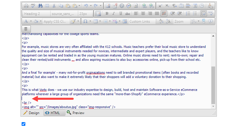
- Add in both Code 1 and Code 2 to the topic:

- Save your topic changes and then refresh the front end of the website.
You should now see the button trigger modal and modal content on the front end of the website:

When clicked, the modal window will display and darken the background on the website:

For more information on modal window configuration, please see the bootstrap documentation found here.
Was this article helpful?
That’s Great!
Thank you for your feedback
Sorry! We couldn't be helpful
Thank you for your feedback
Feedback sent
We appreciate your effort and will try to fix the article